Before we even touch brush to canvas, there’s an important first step in oil painting: organising your palette. This is where our colours come alive! Think of your palette as your workspace, your mixing ground, and having it organised in a way that makes sense to you is going to be very helpful for your painting process.
Our Limited Palette for Beginners
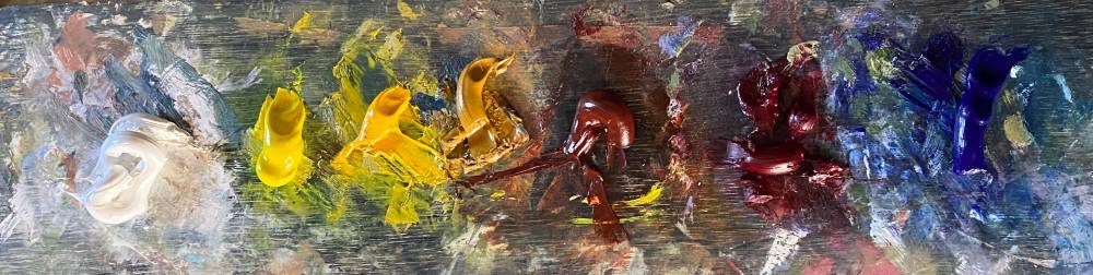
For our classes, we work with a limited palette, which is excellent for learning how colours interact and for creating harmonious paintings. Our limited palette includes:
- Titanium White
- Arylamide Lemon
- Arylamide Yellow
- Yellow ochre
- Burnt Sienna
- Alizarin Crimson
- Ultramarine Blue
- Phthalo Blue
If you’ve taken my classes you will that notice I always recommend setting these colours out in a specific order on your palette: Titanium White, Arylamide Lemon, Arylamide Yellow, Yellow ochre, Burnt Sienna, Alizarin Crimson, Ultramarine Blue, and Phthalo Blue. And I always set them up in that exact order.
Why Consistent Palette Setup Matters
Why be so rigid with the placement? Well, it’s about building muscle memory and efficiency. When you always put your colours in the same spot, you stop searching for them. Your hand knows exactly where to go for the Alizarin crimson or the Ultramarine Blue without you even having to think about it. This frees up your brain to focus on the important stuff like seeing the colour in your subject, understanding its value and temperature, and working out the colour mix you want.
But beyond speed and efficiency, what are some other good reasons to always set up your palette the same way?
Predictable Mixing:
When your colours are always in the same relative positions, you develop a consistent approach to mixing. You’ll instinctively know, for example, that adding the colour to the left of your Alizarin Crimson (Burnt Sienna in our case) will warm it up, while adding the colour to the right (Ultramarine Blue) will cool it down. This predictability builds confidence and reduces brain effort and paint.
Better Understanding of Colour Relationships:
Seeing your colours laid out consistently helps you understand their relationships to each other on the colour wheel, even if you don’t have a full spectrum of colours. You start to see how your warm and cool blues sit next to each other, how your yellows relate to your reds, and where your earthy Burnt Sienna fits in. This visual reinforcement is invaluable for learning colour theory in practice.
Reduced Decision Fatigue:
As beginners, there are already so many decisions to make when you’re painting – what brush to use, how much medium, what mark to make. By making your palette setup a no-brainer, you eliminate one source of potential overthinking and can channel that mental energy into the creative process itself.
Easier to Spot Missing Colours or Contamination:
If you’re used to seeing your palette in a specific arrangement, you’ll immediately notice if a colour is missing or if one colour has accidentally crept into another pile. This helps keep your colours clean and your mixes true.
More Tips for Setting Up Your Oil Palette
So, consistent layout is key. What are some other good tips for setting up your oil painting palette, especially when you’re starting out?
One I often see students struggle with is this: Don’t squeeze out too little paint to start with! It can feel wasteful to put out a generous splodge, but trying to mix enough paint for even a small area from a tiny bead is frustrating and often leads to running out mid-stroke. Squeeze out a reasonable amount – enough that you can easily get a good amount of paint on your brush or palette knife for mixing and application. You can always squeeze out more if you need it, but constantly going back for tiny bits interrupts your flow.
Here are a few more tips to help you get the most out of your palette setup:
Leave Ample Mixing Space:
Don’t crowd your colours! Leave a large, clear area in the centre of your palette for mixing. This is where the magic happens, and you need room to manoeuvre your brush or knife and really see the colours you’re creating.
Place Your White Strategically:
Many artists place their white in a convenient spot where it’s easy to access for tinting other colours. Given it’s the colour you’ll likely use the most for lightening, think about where makes the most sense for your workflow. On our palette, starting with Titanium White makes it readily available.
Consider Your Palette Surface:
The colour of your palette can influence how you perceive your mixes. A neutral grey palette is often recommended as it doesn’t visually interfere with the colours you’re mixing as much as a white or coloured surface might. However, a traditional wooden palette, which often has a warm tone, works perfectly well too – you just need to be aware of how it might affect your perception.
Keep it Clean (relatively!):
While some artists embrace a wonderfully messy palette, for beginners, keeping your mixing area relatively clean between major colour groups will help prevent accidental muddying of your colours. Scrape away excess paint before mixing a new colour family.
Work from Light to Dark for Mixing Light Colours and from Dark to Light for Mixing Dark Colours:
When you’re mixing a light colour, a common approach is to start with the lighter colour and add the darker colour gradually, with the opposite being true for mixing dark colours. This gives you more control over the final mix.
Setting up your palette is a small but significant step in your painting practice. By being deliberate about how you arrange your colours and following a few key tips, you’ll set yourself up for more confident mixing, a better understanding of colour, and ultimately, a more enjoyable painting experience. I like to include cleaning and setting up my palette as part of my ritual of getting into the right mind space for painting.
Now, grab your tubes and your palette, and let’s get some colour mixed!