Your cart is currently empty!
Fundamentals of Painting
Unlock the Secret to Stunning Paintings: The Power of Value Studies
Have you ever looked at a painting and felt a sense of realism, a feeling that you could almost step right into the scene? More often than not, that captivating effect comes down to one fundamental element: value.
Think of value as the light and shadow in your world – how light or dark something appears. In painting, mastering value relationships between the shapes in your composition is like building a strong foundation for a house. Get these relationships right, and you dramatically increase your chances of creating a recognizable and compelling piece of art.
It might surprise you, but value is often more crucial than color in creating a convincing painting. While color adds vibrancy and mood, it’s the interplay of light and dark that defines form, depth, and ultimately, believability.
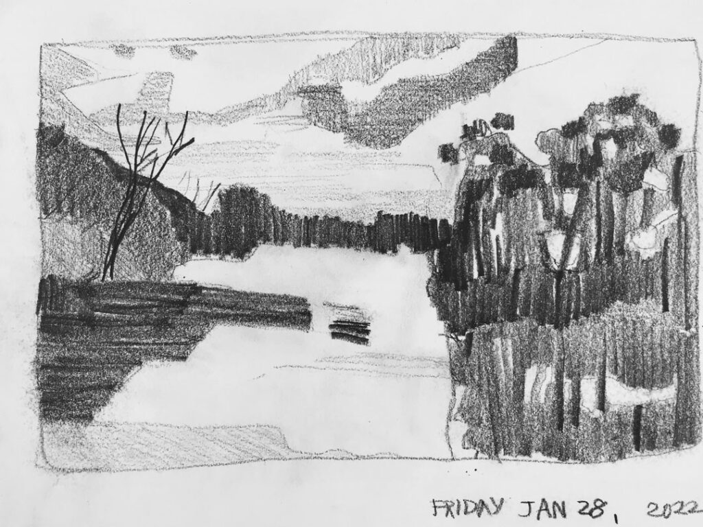
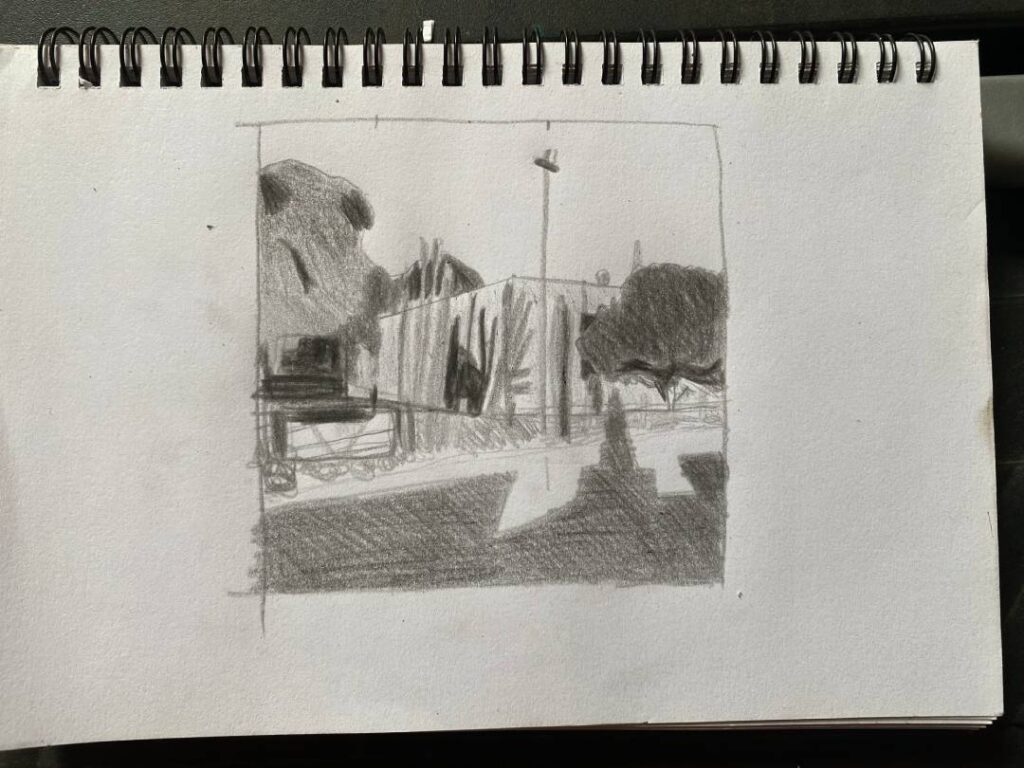
For me, the journey of a painting often begins with a sketchbook and a 4B pencil. This is where I explore the world of value through quick sketches. These aren’t meant to be masterpieces in themselves; they’re my way of understanding the underlying structure of light and shadow in my subject.
Sometimes, as I complete a value sketch, I realize that the initial composition I had in mind isn’t as strong as it could be. This is where the magic of value studies truly shines! They act as a visual testing ground, helping me decide whether a particular approach to my subject will translate into a visually appealing painting before I even touch my brushes and paints.
Beyond composition, value studies are also an invaluable practice run. They allow me to map out the main shapes, understand how they relate to each other in terms of light and dark, and ultimately give me a much quicker and more confident start when I move to the canvas. For more complex subjects, I often create two or even three value studies. This deep dive helps me truly internalize the shapes and their placement within the picture plane.
Curious about how I approach these essential value studies? Here’s a glimpse into my step-by-step process:
- Refining the View: I start by cropping my photographic reference to pinpoint the composition that truly speaks to me.
- Setting the Stage: Using this cropped image, I establish the boundaries of my sketch.
- Capturing the Essence: I then sketch the large, dominant shapes directly from life, constantly referring back to my reference photo to ensure I stay within my chosen parameters.
- Building Detail: From life, I begin to introduce the medium and smaller shapes within those larger forms.
- Defining Light and Shadow: Using a simple system of three values – light, mid, and dark – I fill in these shapes. This helps me visualize the distribution of light and shadow.
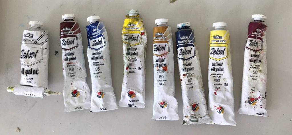
- My Go-To Tool: I prefer to work in graphite, usually with a soft 4B or 6B pencil, as it allows for a good range of tonal values.
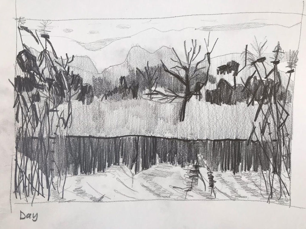
A Peek into My Sketchbook:
Here are a few examples of value studies from my sketchbook, often inspired by the beautiful landscapes around me:
If you found this insight into my process helpful, you might also enjoy these related posts:
- Where I find inspiration for my paintings
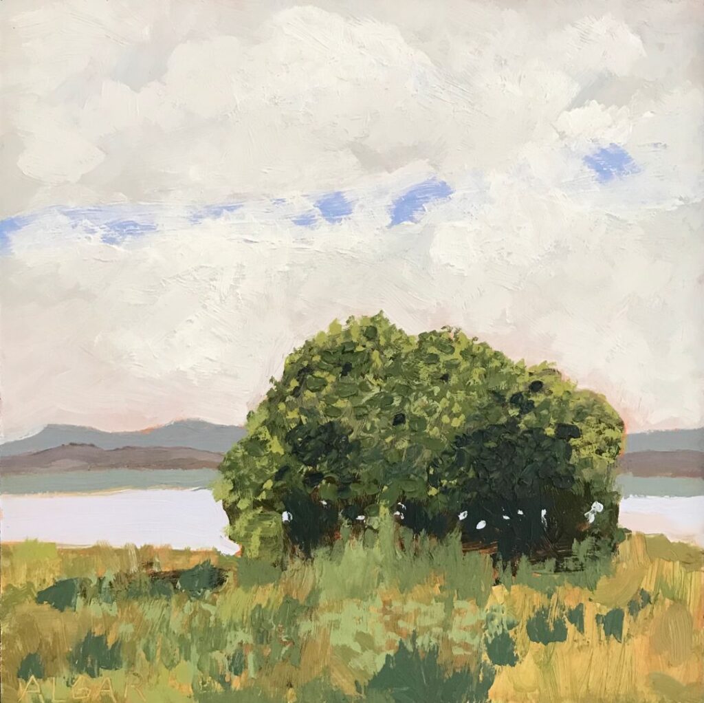
- See the paintings I create from some of these value studies.
Want to delve deeper into the world of value and unlock your own painting potential?
I offer a free online oil painting basics course online where you can learn these essential techniques. Whether you’re a complete beginner or looking to refine your skills, my painting classes provide a supportive and inspiring environment to grow as an artist.
Explore my FREE oil painting course here.
Even if you’re not ready to jump into a class just yet, I invite you to explore more of my artwork and process. You’ll find a gallery of my recent paintings here, and more blog posts here.
Understanding value is a game-changer in representational painting. It’s a skill that, with practice, you can easily master. I hope this glimpse into my process has inspired you to see the world around you in terms of light and shadow. Happy painting!
Unlock Colour Harmony: The Power of a Limited Palette for Landscape Painting
As a plein air oil painter, the freedom of capturing landscapes directly from life is my greatest inspiration. However, lugging a full studio setup into the field can quickly become a burden. This is where the beauty and practicality of a limited palette truly shine.
While I previously called the scenic town of Hermanus, South Africa, home and sourced my paints locally, my passion for painting landscapes en plein air continues wherever my life takes me. The principles of a limited palette remain constant, offering significant advantages for any landscape artist, whether you’re painting along the coast or amidst rolling hills.
Tracy Algar, Lone Milkwood on Hermanus Lagoon, 2023. Why Embrace a Limited Palette for Landscape Painting?
There are compelling reasons why many landscape painters, myself included, choose to work with a curated selection of colors:
Lightweight and Portable: For those who love to paint outdoors, like me, minimizing your gear is essential. A smaller selection of tubes translates to a lighter set-up, making it much easier to get to those perfect, inspiring locations. Unless you have the luxury of driving right up to your painting spot, a lighter kit makes all the difference.
Effortless Color Harmony: This is perhaps the most significant benefit. By mixing most of your colors from a limited set, you naturally create a sense of visual unity in your painting. The colors will inherently relate to one another, resulting in a harmonious and cohesive artwork. Everything just works from a color perspective.
Fuelling Creativity Through Constraints: Limitations can actually spark greater creativity. When you have fewer colours at your disposal, you’re forced to think more inventively about mixing and colour relationships. This can lead to unexpected discoveries and push you beyond your comfort zone, encouraging bolder colour choices that often yield exciting results. It helps overcome the tendency to play it safe and encourages you to truly push the colour, confident that it will likely harmonize within your limited range.
My Go-To Limited Palette for Landscapes:
Over the past few years, I’ve honed a core palette that serves me well for capturing the diverse colours of the South African landscape. While specific brands might vary depending on my location, the essential pigments are the same:
Titanium White: Absolutely essential for lightening values and creating tints. A large tube is always a good idea!
Arylamide Lemon Yellow: A vibrant, cooler yellow that’s a fantastic alternative to more expensive and rather poisonous Cadmium yellows.
Arylamide Yellow: For those rich, high-chroma yellows that really pop in sunny landscapes.
Yellow Ochre: A beautiful, desaturated earthy yellow that’s invaluable for grounding colors and creating natural tones.
Alizarin Crimson: A cool, deep red that’s a workhorse for mixing purples, shadows, and adding depth.
Burnt Sienna: A warm, earthy pigment that’s excellent for underpainting and mixing rich browns and surprisingly effective dark grays/blacks when combined with Ultramarine Blue.
Ultramarine Blue: Another essential workhorse, perfect for skies, water, distant mountains, and those crucial dark mixtures.
Phthalo Blue: While I use this sparingly, a small tube of this intense, cool blue can be incredibly useful for vibrant skies or water, especially in coastal scenes.
Occasionally, depending on the specific subject, I might include an extra colour like a warm red or a pre-mixed purple. However, the core eight above provide a versatile foundation for mixing a wide range of landscape hues.
Adapting to Your Environment:
The beauty of this limited palette is its adaptability. Whether I was painting the unique light of the Overberg landscape with my Zellen oils or now exploring new vistas in the Karoo, these core pigments allow me to capture the essence of any scene. The principles of colour mixing and harmony are universal.
Experimenting with different limited palettes can be a rewarding journey for any artist. This selection has proven its versatility for capturing the vast and varied beauty of the natural world. Give it a try and discover the surprising range and harmony you can achieve with just a few well-chosen colours!